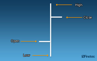
 Bar charts are among the most popular types of charts used in technical analysis. Like a line chart, a bar chart shows the closing price of a currency, but it also shows additional information: the opening price as well as the highest and the lowest prices reached during the day/week/hour. Since the bar refers to a segment of time, you ought to know what exact frame of time it covers before you start analyzing any bar chart.Since bars also display the Open, the High, the Low and the Close price for a given currency, they are also referred to as “OHLC” charts. Here is what a bar looks like:The top of the bar shows the highest traded price for a given currency and a given time period. The bottom shows the lowest traded price for that same currency and during that same time period. As a whole, the vertical bar thus shows the currency’s trading range for the given time period.The horizontal dash on the left of the bar indicates the opening price while the one on the right side indicates the closing price.
Thursday, September 3, 2009
Forex Charts: The Bar Chart 1
 Bar charts are among the most popular types of charts used in technical analysis. Like a line chart, a bar chart shows the closing price of a currency, but it also shows additional information: the opening price as well as the highest and the lowest prices reached during the day/week/hour. Since the bar refers to a segment of time, you ought to know what exact frame of time it covers before you start analyzing any bar chart.Since bars also display the Open, the High, the Low and the Close price for a given currency, they are also referred to as “OHLC” charts. Here is what a bar looks like:The top of the bar shows the highest traded price for a given currency and a given time period. The bottom shows the lowest traded price for that same currency and during that same time period. As a whole, the vertical bar thus shows the currency’s trading range for the given time period.The horizontal dash on the left of the bar indicates the opening price while the one on the right side indicates the closing price.
Subscribe to:
Post Comments (Atom)
No comments:
Post a Comment